Setting Chart Colors and Themes
The default visualization colors and font styles are determined by a “theme” that applies to the entire Qrvey app. The default theme can be modified and many of its settings can be further customized within each individual chart’s configuration. This article explains the various layers of applying colors and adjusting font styles of charts and their panels.
Choosing Colors for Charts
Some charts, such as regular Bar and Line, use a single color to depict the values by default. These are the types of charts where the data values are the center of attention and not the categories for each value. The default single color (also called the Main color) used for these charts is shown, and can be changed, either from the Chart Builder Toolbar, or from the Styles section of the Configuration Panel.

If you wish to change the main color used for your chart, click in the colored box and change the color from the standard color picker dialog that is presented. Note that this change will only apply to the chart that is being designed and all other charts will continue to be created with the same default color as before. The color picker also supports the option to apply transparency.

You can choose to apply a different color for each category by picking By Category from the Color Type dropdown in the Styles section of the Configuration Panel. This feature is useful if the categories that are presented in the chart have special meaning in your analytics. For example each bar in the Bar Chart may be associated with a status and the statuses have specific colors in your product (e.g. delayed depicted in red, and on time depicted in green). If this mode is selected, the default sequence of colors is shown and used to apply one color of the sequence to each category. Each sequence consists of 10 pre-determined colors and colors are assigned to the categories, cycling from the first to the last and repeating when all of the colors are used. In this mode you can choose to fix the association of each category with a color by selecting the Match colors across charts checkbox. This feature is explained in more detail in the Assigning Fixed Colors to Categories section in this article.

Multi-colored charts, such as Pie or Funnel, use a sequence of colors, very much like when the Color Type of a single-colored chart is set to By Category. The default sequence that is automatically assigned to the chart is shown and can be changed, either from the Chart Builder Toolbar, or from the Styles section of the Configuration Panel. There are 14 predefined sequences of colors to choose from. The chosen sequence of colors is used to apply one color to each category. Each sequence consists of 10 pre-determined colors and colors are assigned to the categories, cycling from the first to the last and repeating when all of the colors are used.

To read more about setting color styles for different charts, go to Chart Types and check the Styles section of a specific chart.
Assigning Fixed Colors to Categories
There are occasions when colors have specific meanings in your analytics and you wish to customize the colors assigned to each category of data, rather than going with the defaults chosen by the product. For example, if you are displaying the volume of sales of different flavors of ice creams, you may want to assign pink to strawberry, brown to chocolate flavor, and cream to vanilla. You may also want to use the same three colors consistently across all visualizations that are based on the same dataset. To achieve this effect select the Match colors across charts checkbox in the Styles section of the Configuration Panel. Doing so will cause a palette icon to appear next to the selected color sequence. Clicking on the icon opens a dialog to list all of the categories and their assigned colors. Each color can be modified individually to fit your preferences. Furthermore, the chosen colors will persist across all charts that are created based on the same dataset.

Managing Themes
In Chart Builder, you can customize the colors used for depicting data in various charts. The defined colors apply to the chart for which the customization was made, and they don’t affect the default colors for other charts. Note that the Match colors across charts setting is an exception to this rule, but even that only applies to charts that are based on the same dataset. Furthermore, the selections are only about “colors” and don’t offer any control over the panel style, used fonts, and the like.
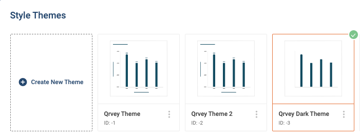
To give all your charts a unified look and feel, use the Style Themes feature to create a customized theme that replaces the default theme settings. Beginning with version 8.1, this feature provides the following default themes:
- Qrvey Theme. The legacy default theme supported in applications created in version 8.0 and earlier.
- Qrvey Theme 2. The new default theme introduced in version 8.1. Theme 2 expands the number of colors provided in the Data Visualization section from 20 to 100, as shown in the screenshot below.

- Qrvey Dark Theme. Introduced in version 8.4, Qrvey Dark Theme applies a dark mode to the dashboard, charts, and chart panels.
To create a new theme
Click the Style Themes icon in the toolbar.

The Style Themes dialog displays.
Click Create New Theme. The Create New Theme dialog displays.
Follow the steps described in "To modify theme settings" below.
To edit an existing theme
Click the Style Themes icon in the toolbar.
The Style Themes dialog displays.
Locate the theme you want to edit, click its three-dot menu, and click Edit. The Edit Theme dialog displays.
Follow the steps described in "To modify theme settings" below.
To modify theme settings
Create a new theme or edit an existing theme. The Create New/Edit Theme dialog displays.
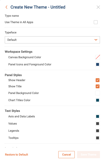
To apply this theme to all applications, select Use Theme in All Apps.
Click the Typeface drop-down menu and select a font to use in the application. To use the default font, select (Default).
Note: If you intend to use CSS to modify the typeface, select (Default). For more information, see Customizing the Appearance Using CSS.
Under Workspace Settings, select the following colors:
- Canvas Background Color
- Panel Icons and Foreground Color
Under Panel Styles, select whether to display or hide the following panel items:
- Header
- Title
Click the box next to Panel Background Color to display the color picker dialog. Use the options provided to set a color.
If displaying the title, click the box next to Chart Titles Color to display the color picker dialog. Use the options provided to set a color.
Under Text Styles, click the box next to each text item to display the color picker dialog. Use the options provided to set a color for that text item.
- Axis and Data Labels
- Values
- Legends
- Tooltips
Under Data Styles, click the box next to Main Color to display the color picker dialog. Use the options provided to set the main color for the data.
Select the colors to use for Data Visualizations. For your convenience, one hundred colors are chosen randomly by the system. You may change any of the colors individually, or you may click Generate New to randomly generate a new set of one hundred colors.
Under Table Header Styles, click the box next to each option to display the color picker dialog. Use the options provided to set a color for that text item.
- Header Font Color
- Header Background Color
- Click Save Theme. Once created, a theme can be further edited, chosen to apply to all of your applications, duplicated to be used as the basis for another theme, or deleted, from the three-dot menu on the theme card.
Note: Embedded widgets support the use of CSS variables to customize the visual theme. For more information, see Customizing the Appearance Using CSS.
To duplicate a theme
Click the Style Themes icon in the toolbar.
The Style Themes dialog displays.
Locate the theme you want to duplicate, click its three-dot menu, and click Duplicate. The new theme displays in the Style Themes dialog. You may now choose to Edit, Duplicate, or Delete the theme as needed.
To delete a theme
A theme in a “shared application” that has been created by someone else, can only be deleted by the owner of the application. Such a theme will not have the Delete option in the menu.
Click the Style Themes icon in the toolbar.
The Style Themes dialog displays.
Locate the theme you want to delete, click its three-dot menu, and click Delete. A dialog displays verify that you wish to delete the theme.
Click Yes. The theme is deleted.
Accessing a Theme Programmatically
Each theme has a unique ID that can be used for accessing the theme programmatically. The Theme ID is always displayed in the UI from the list of themes. Developers can copy and paste the ID of the desired theme into the embedded widget JSON configuration code, if they need to handle the theme programmatically.